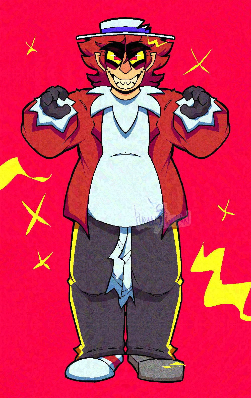
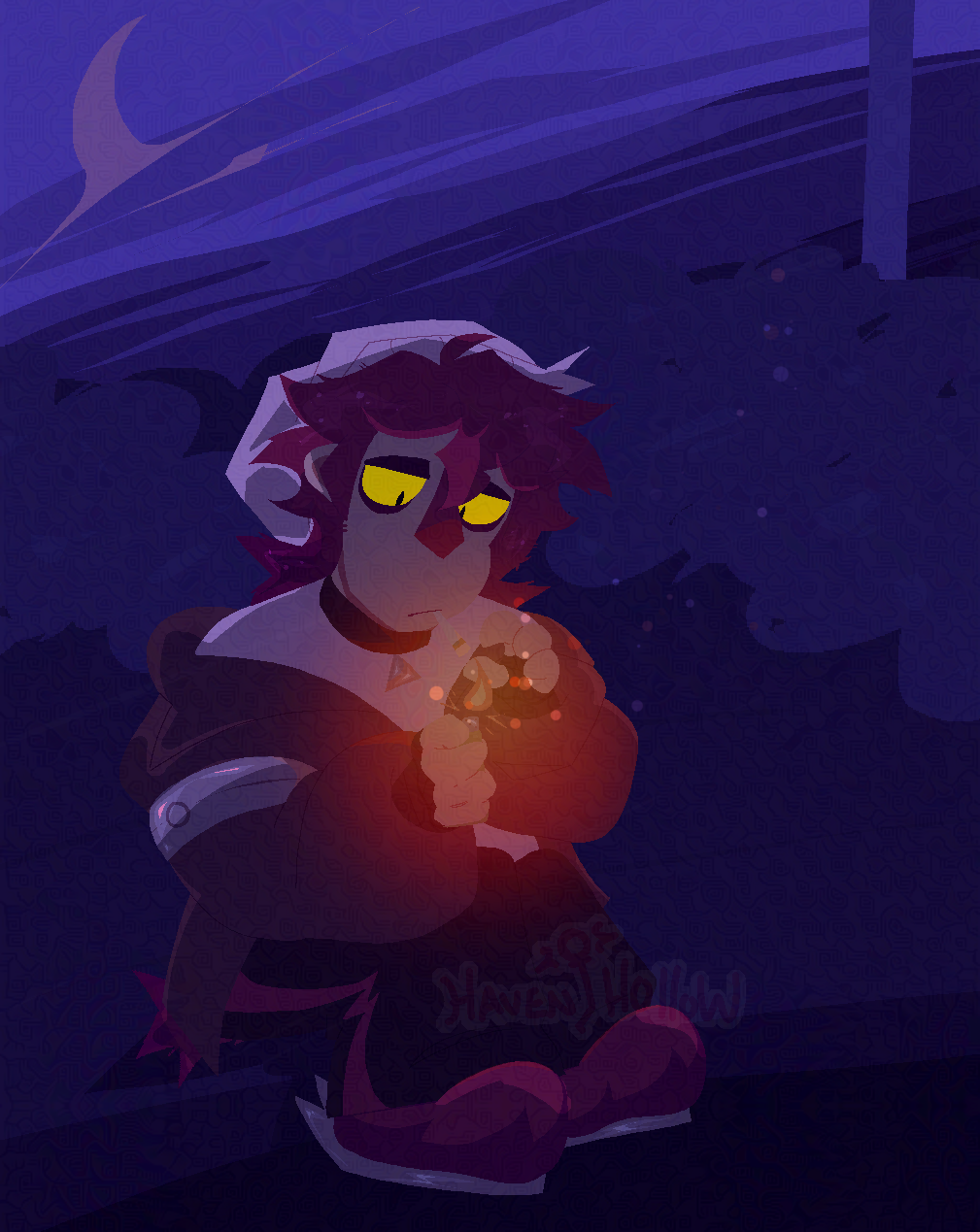
Note: This page has containers with projects inside of them. These containers can be scrolled using the scroll wheel, or the sidebar.
Return to homepageDigital illustration (IbisPaint X)
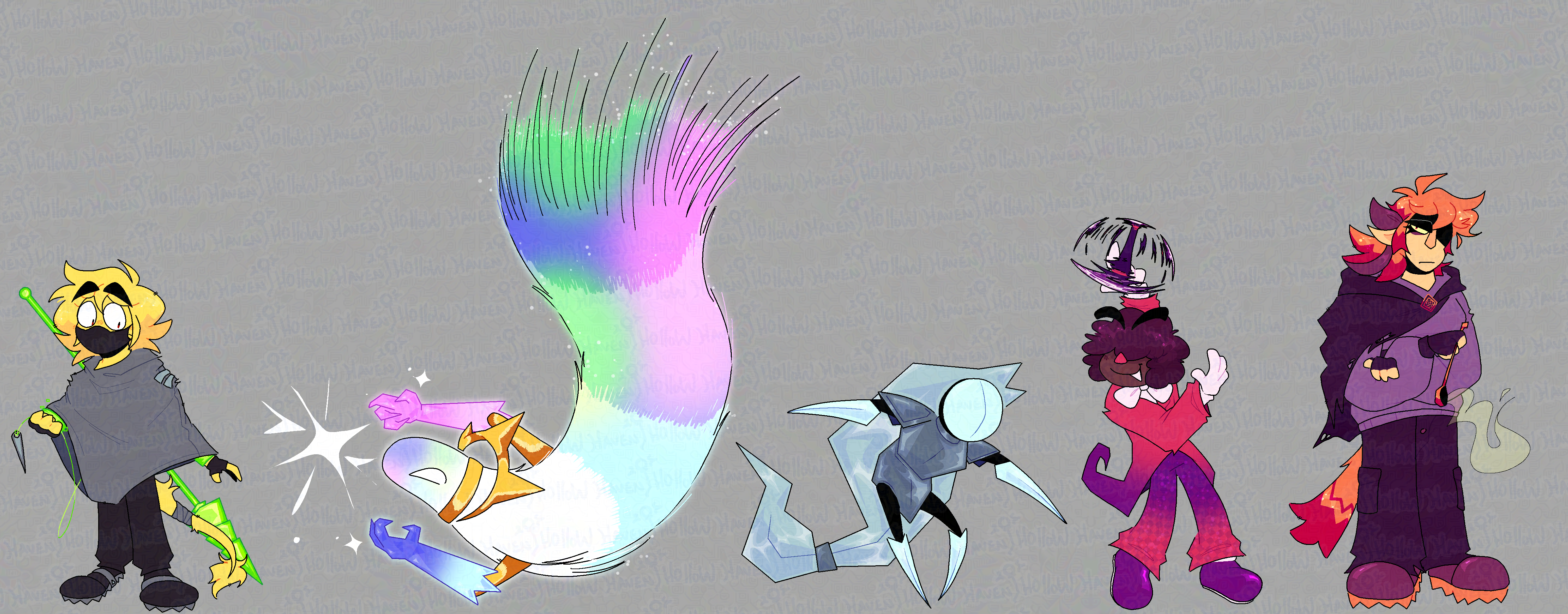
Combined set of character designs accumulated over a period of about 3-4 weeks.
The aim was to try to create characters with a diverse range of species (human, humanoid, non-objective) and with differing design elements and silhouettes. Shape language is something I'm not as strong with, but I tried incorporating it here - Especially with the contrast between a softer flowing character and a sharper angled character. This also let me mess around with the rendering/shading somewhat, where I could emphasize shadows and highlights on golden or metallic elements; I also got to play with textures like crystals and glowing/light source elements.
Additionally, these characters are intended to be vibrant and cartoony, and have proportions like such. I had to make sure the characters were appropriately scaled side-by-side (the left-most character is about 5'5") when making the canvas layout. This project is still currently ongoing, and it's not so much a learning experience as it is a design drill, like practice or exercise. It involves a plan where I have to decide on a restricted and thoughtful colour palette, then I draw a few design proposals for each character, then I draw the key pose and continue from there. It's also purposefully simplified so I don't burn myself out as fast.
Digital illustration (IbisPaint X)
Based on Pent from Supermental. Was intended to be an experimental piece with a lot of noise (static) and bold shading/outlines.
This piece was an exercise in breaking out of my typical style. I don't normally leave my lineart uncoloured (therefore, just solid black) and I tend to keep my shadows slightly darker. Something struck me that day, and I really wanted a piece that felt loud and obnoxious. This is also lent to in some of the colours, where I made the eye sclerae bright neon yellow and the pupils a very saturated pink-red. This piece was also like a test run for me using the lasso tool, and since then I've been incorporating it in my pieces more. I found that it gives my work a bit of an intentional imperfection, which is a style I've been enjoying so far. I also find that using bolder outlines in certain places can help distinguish the perspective of something, where sometimes I felt I struggled with trying to get foreshortened hand poses to look less homogenous (ie. indistinguishable from the background). Overall very fun exercise that helped me familiarize myself with some design choices I otherwise don't lean towards.
Digital illustration (IbisPaint X)
Original character. Three-hour long piece with the challenge of being restricted to certain colours, and only the lasso fill tool (with one other dot brush for garnishes). At the time I was even less familiar with the lasso tool, solely using it for non-objective or semi-transparent highlights, but this piece actually made me realize the overall usefulness of it. The lasso tool, for me, can be used to get some really nice sharper points that I can't otherwise reproduce with my normal brush without having to purposefully erase and taper lines. Also, I tend not to do lineless pieces like this, since it's a tad more time-consuming, but this one made me reconsider since I found the process deceivingly therapeutic. I'm also a bit averse towards drawing full scenes with background elements and props, so making this piece also involved the work of placing things in a drawn space and making it work.
I used some gradation maps, and also worked with contrast to create a focal point (orange on purple). I like how it works, and I really like how it turned out. It helped me break the mindset of trying to get all of my background scenes to be overly perfect, and I was able to settle with a slightly messier (but still readable) environment.